The dashboard: everything at a glance
What you see on your dashboard and exactly how we calculate your kWh, EREs and costs.
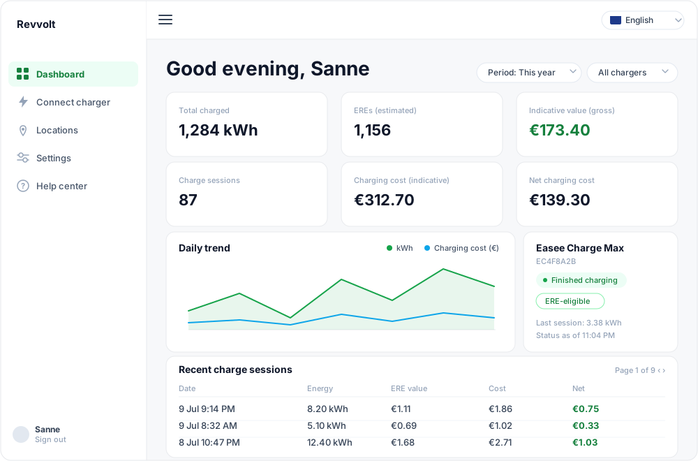
The dashboard is your home screen once you sign in. At the top we greet you personally, and below it you'll find your key figures, charts and your chargers — all scoped to the period you choose.
The period and charger filter
Top right is a filter that sets the period your figures cover: All time, Last 30 days, Last 90 days, This year, or a Custom range with a start and end date. If you have more than one charger, you can also filter by one or more specific chargers.
Important: this filter applies to the whole dashboard. Every key figure, the charts and the recent charge sessions table all respect the selected period.
The key figures and how we calculate them
The six tiles at the top are always based on the charge sessions within your selected period.
Total charged
The sum of all kWh from your charge sessions in the period. This is the basis for almost every other figure.
EREs (estimated)
An estimate of the ERE certificates you're building up. We derive it from your green kWh using the statutory yearly parameters:
ERE = kWh × renewable-fraction × fossil-reference × 3.6 / 1000
The renewable fraction and fossil reference aren't numbers we invent — they're fixed per year and centrally managed. So this is an estimate that only becomes final when registered with the NEa.
Indicative value (gross)
Your total charged kWh multiplied by the mid ERE market price (in €/kWh). The real ERE price moves daily with the market, so we deliberately show the mid scenario as guidance, not a promise.
Charge sessions
The number of charge sessions in the period — simply a count.
Charging cost (indicative)
Roughly what the electricity to charge cost you. This depends on your energy contract (set under Settings → Finance):
- Dynamic contract: we calculate hour by hour using the exchange price at the moment of charging, plus an estimated energy tax, supplier markup and VAT.
- Fixed contract: we use your fixed prices per time range.
If you haven't set a contract yet, this tile stays empty with a button to set one.
Net charging cost
The figure it all comes down to:
Net charging cost = charging cost − gross ERE value
In other words: what charging costs you on balance after subtracting the value of your EREs. A negative amount is good news — your EREs earn more than your electricity costs.
If you have a fixed contract, an extra line sometimes appears showing whether a dynamic contract would have been cheaper or more expensive for these sessions — purely indicative.
Daily trend
This chart plots your charging per day across the selected period: charged kWh, charging cost and ERE value side by side. Handy for spotting peaks and trends.
Charging pattern
The heatmap shows when you charge: your charging volume spread across day of the week and hour of the day. Darker means more kWh at that moment.
Recent charge sessions
At the bottom is a table of your charge sessions within the period, showing the date, energy (kWh), ERE value, cost and net result per session. If there are more than ten, you page through them ten at a time with the buttons at the bottom right. All amounts are indicative.
Your chargers
To the right of (or below) the table are cards for your connected chargers and their live status. Read more in Viewing and managing your chargers.
Ready to earn with your charger?
Create a free account — Revvolt handles NEa registration, the sale and the payout of your EREs.